Make your page POP!
There are so many Elements & Principles of Design that you can use when painting that it can be a bit overwhelming. The next time you’re painting or journaling, try focussing on just one element. Today I’m going to talk about value contrast. Value simply refers to the light and dark in an artwork. Value contrast refers to the relationship between the areas of light and dark.
There are two ways I put value contrast to work for me in this acrylic art journal spread:
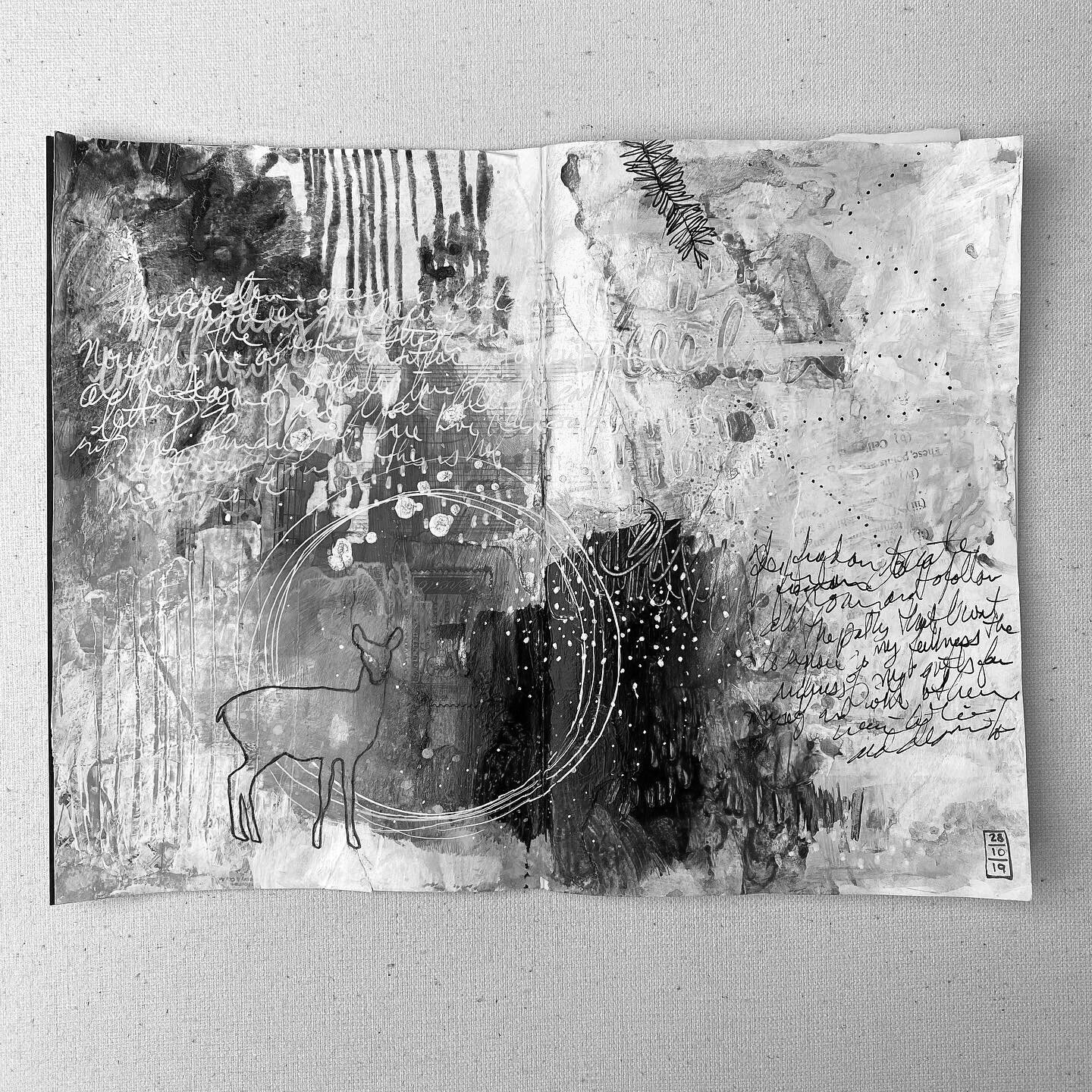
Black & White. By choosing a drawing media from each end of the value scale, I’m automatically introducing contrast. In this spread, I used a permanent black pigment pen and a white acrylic paint pen for both drawing and writing.
Placement. Mindful placement of my black and white elements will create high-value contrast. In the journal spread below, you’ll notice the white writing and the white dot pattern are atop darker blue areas. The black branch ( top right page) and the black writing are on white or lighter areas. Black on light, or white on dark - make your elements POP!
Understanding value contrast in a finished work
A simple way for you to examine value in your own artwork is to photograph it and turn the image into black and white one. Most phone editing programs will allow you to adjust the “Saturation” of your photograph. Just slide the adjustment until your images is desaturated (no colour). Without the confusion of colour, you can more easily see how much value contrast you have or don’t have. Areas with the highest value contrast will likely be your focal points. In my journal spread, the area the POPS is where the circlular lines cut through the white dot pattern area. Those lines then lead the eye to the deer which is also focal point.
If you notice that your painting looks mostly grey, all is not lost! Get back to your painting area - you can continue to work with the image, adding both lighter and darker areas with layers of paint or pen work in the form of writing or drawn elements like an animal or botanical image.


